THE LORA ALLIANCE REBRAND
The LoRa Alliance™ is an open, non-profit association of members working to advance and improve the Internet of Things era. They are an international organization with over 400 members, from dozens of countries operating all over the world. In 2017, I led the effort to rebrand the organization—a complicated process that required consensus from more than 30 members of the global marketing committee.
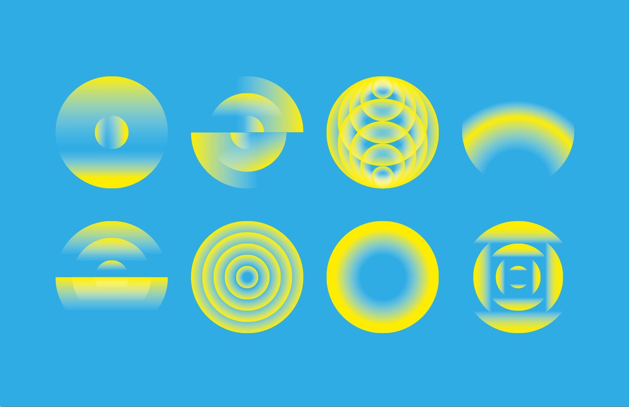
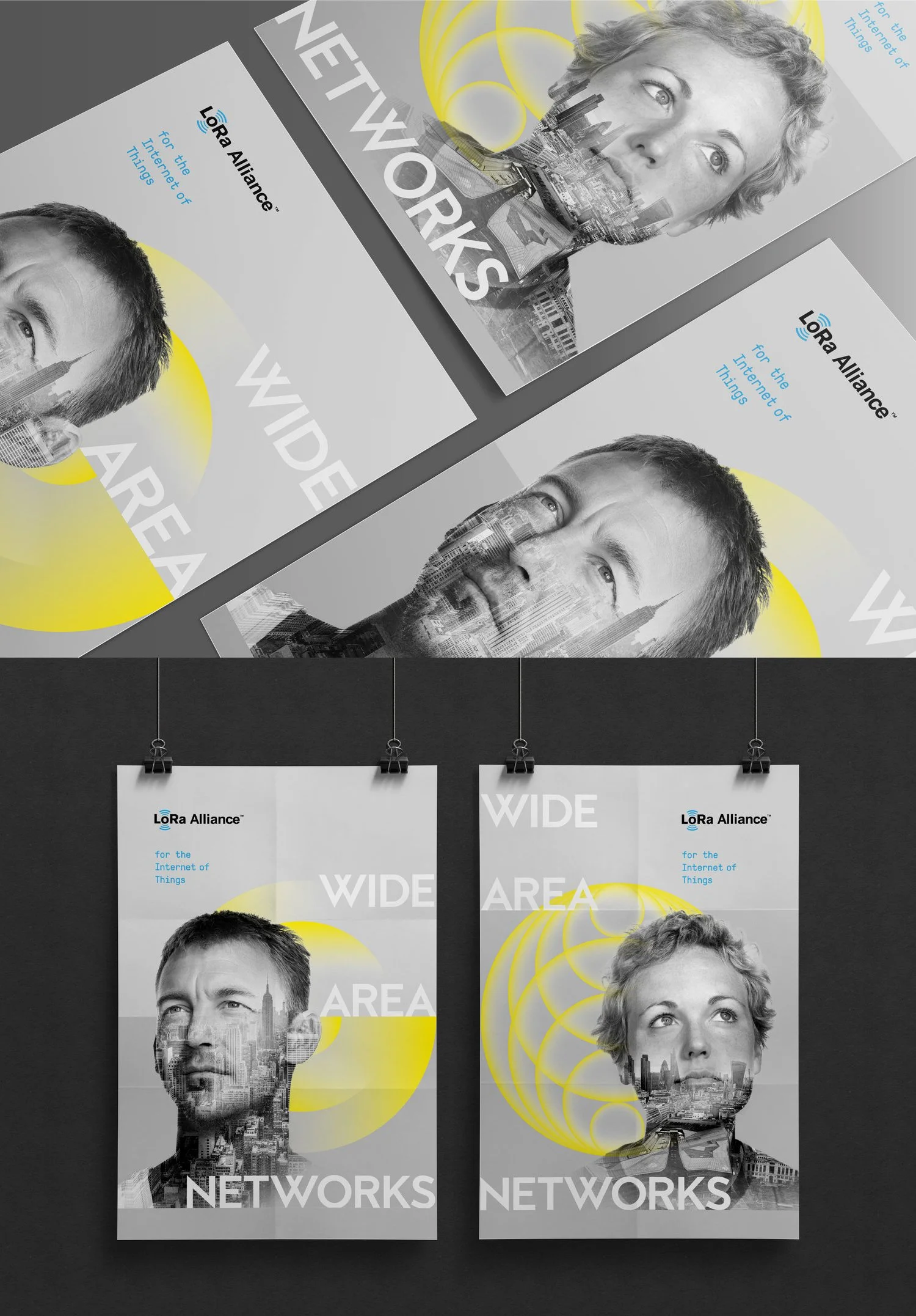
We built the design system and visual identity around concepts core to the Internet of Things. We wanted to make the invisible nature of wireless communication visible and tangible. We wanted to create a sense that the power and benefits of IoT permitted the physical world while also brining a human touch to an often cold, tech-centric industry.
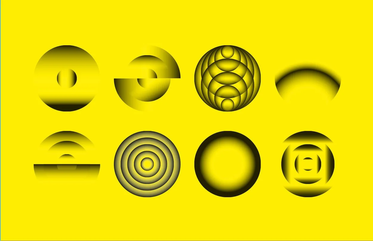
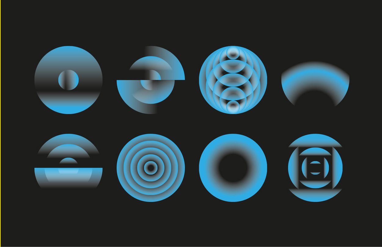
We started by exploring visualization of signal waves and landed on a suite of illustrations that felt simultaneously technical, scientific and natural.
When developing the color pallet, we kept the core blue from the original identity and introduced a number of soft natural colors to keep the brand feeling natural, human and not too technical.
Typography needed to be clean, clear, modern and not overstated. It needed to feel sophisticated, but never calling to much attention by being overly stylized.
Despite being an organization focused on digital experiences, the most important touch points for the brand exist in the real world with conventions, live events, annual reports and other tangible experiences.


